
Kerning
As a graphic designer, in my work I often encounter typefaces that lack important kerning pairs. When this happens, I have to manually adjust the problem areas in the layout, change the font in a font editor or simply look around for another font. The following text offers an overview of the important kerning pairs that are often missing in fonts, making it difficult for designers to use specific fonts without running into problems.
This text was originally based on my presentation “Forgotten kerning” at the ATypI conference held in Reykjavík, Iceland in 2011. Feel free to login and edit / improve the text.
Filip Blažek
Note
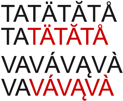
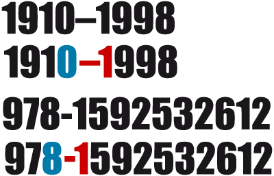
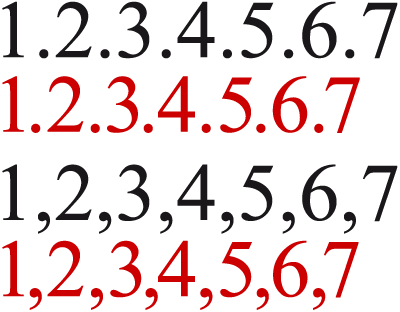
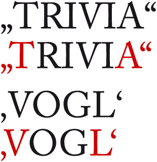
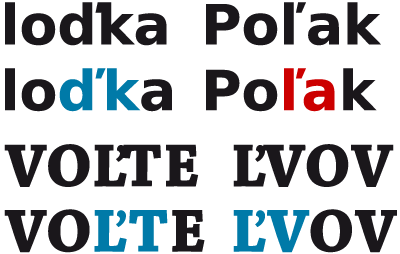
Red color represents negative kerning value, blue color represents positive kerning value.

Diacritics
Even though one can still encounter fonts where kerning for accented letter is completely lacking (even Arial, which some people still think is a good font, is guilty of this), more frequently the designer forgets to kern two accented letters next to one another. Such pairs are relatively frequent in a number of European languages.
Lower case—upper case
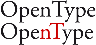
Most fonts ignore lower case—upper case pairs, even though this combination appears in the names of many products, companies, cultural organizations and more. A keyword like OpenType set in such a font then really looks terrible, not to mention iFashion or eFashion...
Upper case—small caps
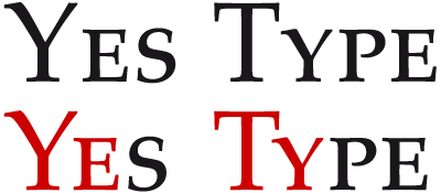
In European typography it is common for small caps to be treated as lower-case letters. In typesetting, small caps are regularly combined with upper-case letters, but every once in a while there is a font that simply ignores this type of kerning.
“Unusual” character combinations
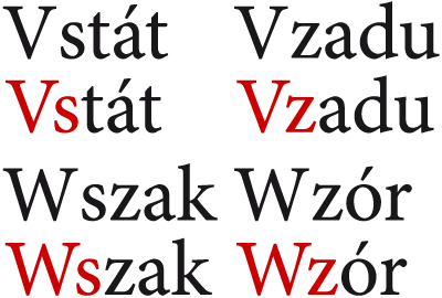
The languages that use Latin letters are highly diverse, and it is beyond the typographer’s powers to have a good understanding of kerning pairs that are needed to satisfy every possible combination. This is why it is not right to leave out a pair that we think does not exist in any language. A number of fonts lack combinations such as Vs, Ws, Vz and Wz, even though these are very frequent pairs in Slavic languages.
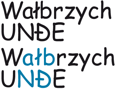
Letters with strokes
Especially among sans serif fonts it is essential that letters with strokes (such as Đ, đ, Ħ, ħ, Ł, ł) have a different metric than the basic letter; this usually is not necessary for serif fonts. In the layout, the stroke can collide with the character next to it, creating dark areas in the text. Often it is enough to adjust the metrics, but sometimes the kerning needs to be changed: The stroke must be considered in the pair NĐ, for example, while it does not in the hypothetical pair CĐ.
Hyphen, dash and other punctuation between figures
Not only those who often lay out academic and professional literature understand just how disagreeable time intervals in years and dates look, especially if a dash is followed by the number 1. Many type designers do not kern punctuation next to numbers, even though this combination is very frequent. Hyphens often appear in various codes (like ISBN numbers), the dash is used in time intervals, and periods or commas (depending on local rules) separate tenths or thousands.
German quotes
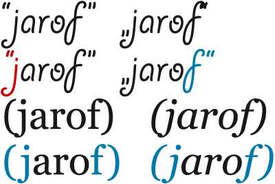
Sometimes I work with fonts that feature pretty careful kerning, but entirely ignore all non-English quotation marks. Yet the combination of low-9 quotation marks followed by the letters T, V, W or Y looks horrible; the same can be said for highreversed-9 quotation marks after the letters A and especially L. Low quotes are far from exceptional—in Europe they are used in Germany, Austria, Hungary and the surrounding western Slavic countries, in the Balkans, the Baltic States, Iceland... When kerning quotation marks, the same values should be assigned to double and single quotes.
Punctuation and quotation marks
If there are a lot of sentences with quotation marks in a text, the combination of punctuation and right quotes draws attention to areas that seem too light. Negative kerning of punctuation and quotation marks solves this problem, but it is necessary to remember that punctuation sometimes remains inside and sometimes is placed after the quote.

Vertical caron
Czech and Slovak characters with the vertical stroke caron is a special category that must be considered. The character ď may be followed by a letter up to the x-height or by an ascender. Technically, the characters ď, ť and ľ can be made wider than d, t and l while adding negative kerning for letters up to the x-height (poľovník) and considering characters with accent marks (ďábel). Or they can be made just as wide as the basic characters, but positive kerning must be added for characters with ascenders (loďka). For regular fonts, this process can be automated and the kerning pair can take the value of the difference between the width of ď and d; an individual approach to creating pairs must be taken for heavy styles.
In the Slovak upper-case Ľ it is necessary to respect that the character could be followed by an upper-case T or V, yet the caron must remain readable. For bold fonts this requires significant positive kerning. The combination ĽV is relatively frequent in Slovak.
Symbols
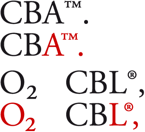
Fonts contain a vast number of symbols, and it certainly would be impossible to kern every possible combination. Nevertheless, in practice I occasionally have to create some pairs manually—usually the symbols ®, ™, subscripts and superscripts, which often collide with right quotes in professional and academic texts. A class for all superscripts, which could also contain some symbols that form pairs with the characters most prone to problems (A, L, right quotes), could be one solution.
Ligatures and alternative letter forms
Ligatures are sometimes forgotten, though it is clear that they should form the same kerning pairs to the left and right as the letters from which they are formed. The same is true for alternative letters, unless they have a completely different character (e.g. the single-bowl and double-bowl g).

Language-specific pairs
Some combinations appear only in certain languages. A number of fonts are completely missing kerning for the Icelandic letter thorn. There is no need to hesitate about assigning the same value to lower-case þ as to the letter p, but the uppercase Þ requires an individual approach. In addition, it forms the frequent pair ÞÆ.

Turkish differentiates between i with and without a dot. It is necessary to take an individual approach to both of these characters as well—whereas the pair Ti may not need any kerning, Tı does.

In some words in Catalonian, a dot is placed between two Ls to highlight the special pronunciation. A vertically centered dot named a “periodcentered” or “middot” which should be visually centered between L·L or l·l is used.

The long s (ſ) is used only rarely nowadays, but as it can still be found in historical literature, lower case and ſ kerning should also be included.
Overlapping characters
While there is no argument among typographers regarding the examples given above, this next part is subject to debate. The purpose of kerning is to optically balance the layout, but in certain cases this can run in opposition to readability. It is up to every type designer to consider positive kerning for overlapping characters. In novels or magazines, a parenthesis colliding with a bulbous terminal in the letter f is not a problem, but in my opinion this should not appear in mathematical typesetting. That said, the absolute unreadability of quotation marks is unquestionably a problem.
Solutions
Many of the missing pairs are the result of incomplete classes in class kerning (see Note bellow), where a key glyph sets the kerning while the character variants (such as those with accents) are filled in automatically. If the hypothetical kerning pair “of” exists, it is necessary to also add pairs for ligatures starting with the letter f either individually or by completing the f class where f is the key glyph and all ligatures starting with f (or long s) will be in the group. Respect for local orthography is important. The variations on quotation marks, numbers or special characters are not so vast that they cannot be included in standard kerning. No single, cohesive database of exceptions and special cases exists yet, so let this text be viewed as an initial attempt to create such a project.
Note
Classes are sets of characters that feature similar characteristics. Classes may include letters (e.g. class A could include Á, Ă, Â, Å, À, Ä, Ą) or even quotation marks (a class with right quotes “ could also include single quotes), dashes, etc. If kerning is created for a font that has a defined class, individual combinations (TA , TÁ , ŤA, ŤÁ...) are not treated; instead, just the value of the command prompt characters — in this case TA — are set. Classes can be located on both, just the left or just the right sides of the kerning pair.